Use Interactive Analytics

Use the Interactive Analytics feature to create and view data sets using real-time information in your Aspen system. These data sets let you quickly gather and review multiple categories of information simultaneously. This way, you can identify and assess situations that require prompt attention or future planning.

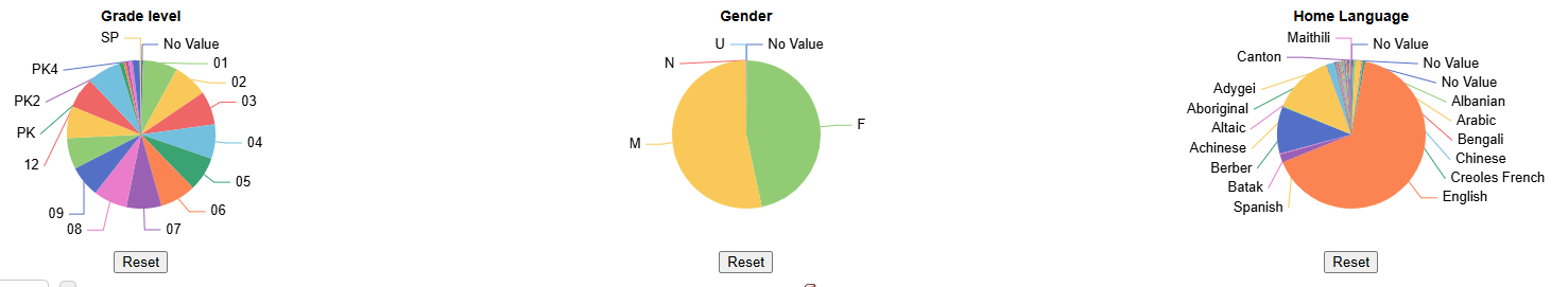
When creating an Interactive Analytics data set, you can choose up to three sets of data. See below for more details.

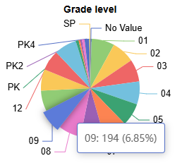
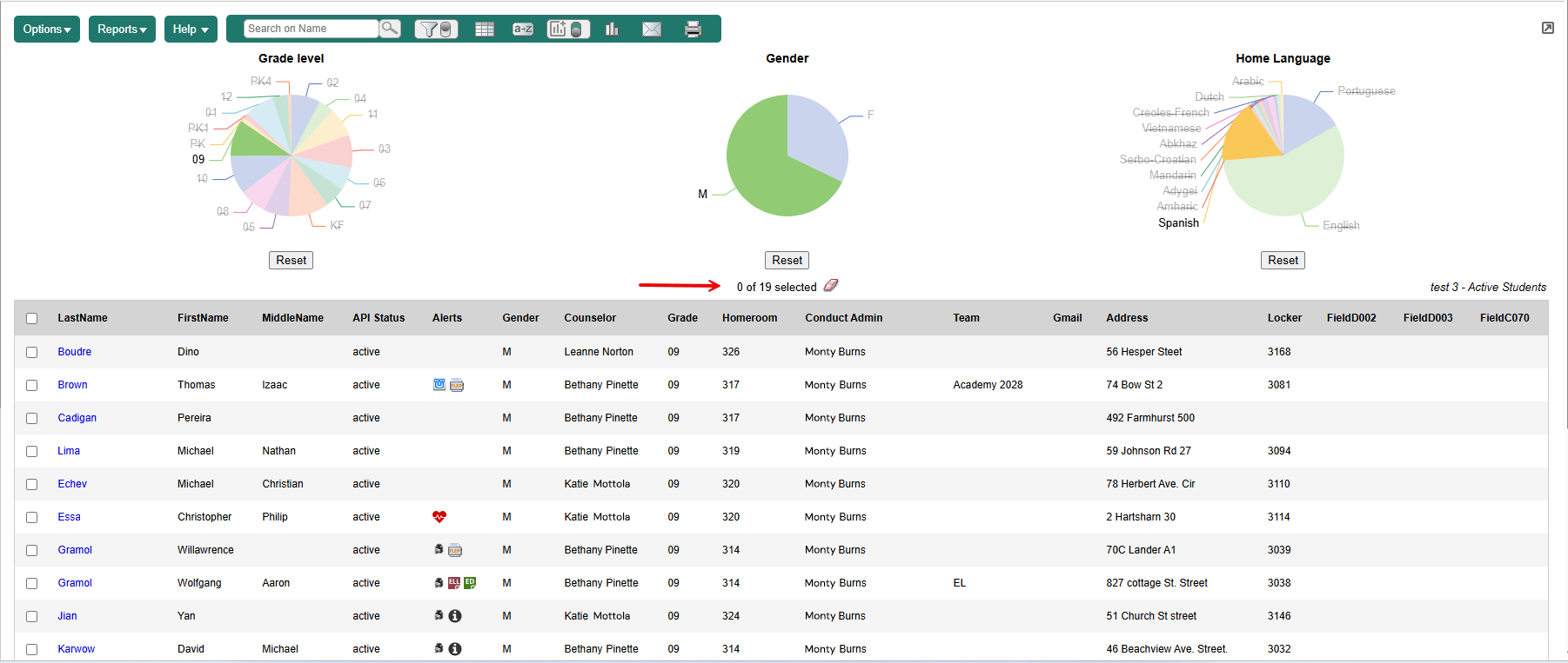
Each set of data appears in a pie chart. Refine the data display by clicking the image. The page refreshes to show the records determined by your clicks.

To create an Interactive Analytics data set:

  1. Log on to the District (Root Organization), Intermediate Organization, School, Staff, Build, Health, Special Education, or Personnel view.

  2. Click the tab for the information you want to view. For example, if you want student information, click Student.

  3. Select the Interactive Analytics menu icon Live Analytics menu icon in 'On' position > Manage Interactive Analytics. The Manage Interactive Analytics pop-up appears.

  4. Click +New. A pop-up appears:

    New Live Analytics pop-up

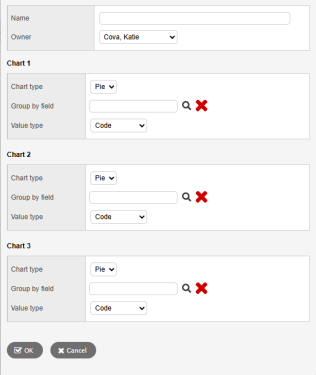
  5. Type a Name for this Interactive Analytics data set.
  6. Click the Owner drop-down to select who will have access to it.

    The Chart type defaults to Pie.

  7. At Group by field, click Search icon. A pop-up appears.

  8. Select an Available Field from the list, and then click OK.

  9. Click the Value type drop-down to select how the data is represented, such as by Code or Description.

  10. Repeat steps 7-9 for Chart 2 and Chart 3 (if desired).

  11. Click OK.

  12. Click Save.

  13. To view your new data set, click the Interactive Analytics menu icon and select it from the drop-down.

Notes:

  • The toggle button Live Analytics menu icon in down position in the menu bar must be in the on (down) position (as shown) for data sets to display on the page.

  • Click Reset to return to the original data set.

Example: An administrator wants to know how many 9th grade male students speak Spanish at home. From the Student tab, they click the Interactive Analytics menu icon. On the Manage Interactive Analytics pop-up, they select Grade level for Chart 1, Gender for Chart 2, and Home Language for Chart 3. Three data sets appear:

Grade level, Gender, and Home Language data sets

Note: You can hover over any part of the image to view the number of records and their percent of the total. In this example, hovering of the 9th grade slice of the Grade level pie chart reveals there are 194 9th graders, which is 6.85% of the student population:

Grade level pie chart with number and percent of student population hover text

When you click one or more parts of a data set, the page refreshes to display the associated records. In the example above, you could click the 8 and 9 slices of the Grade level pie chart for the Student List page to show just 8th and 9th grade students.

To see the breakdown of 9th grade males who speak Spanish, do the following:

  1. Click the 9 (9th grade) slice of the Grade level pie chart. The page refreshes to only display 9th grade students.

  2. Click the M (Male) slice of the Gender pie chart. The page refreshes to only display 9th grade male students.

  3. Click the Spanish slice of the Home Language pie chart. The page refreshes to only display 9th grade male students whose Home Language is Spanish (19 records):

    Student List showing 19 student who meet all 3 criteria